In the digital age, data has become one of the most valuable assets for companies. However, raw data on its own is often meaningless and can complicate decision-making due to its complexity. This is where “data art” comes into play. Data art is the practice of transforming data into comprehensible, impactful, and meaningful visuals. It not only conveys information but also tells a story, making the audience part of that narrative.
What is Data Art?
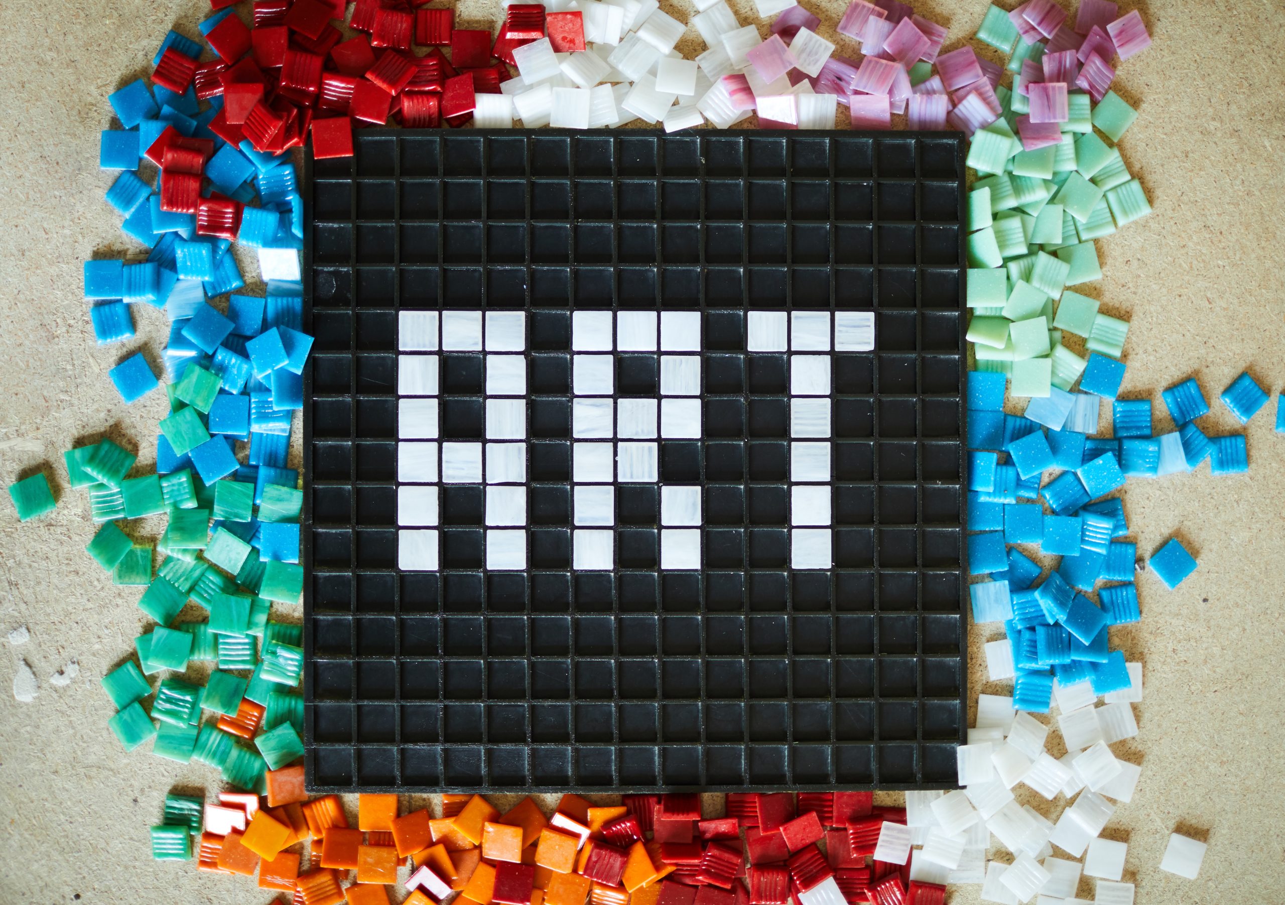
Data art refers to the presentation of complex data through visual, aesthetic, and innovative means. It goes beyond statistical charts by creatively combining information with artistic elements to capture attention. By using colors, shapes, and motion, data art simplifies complex information and creates an emotional impact on viewers.
Why is Data Art Important?
- Simplifies Complexity: Simplified data presentations make it easier for the audience to understand. This is crucial for clear messaging in marketing campaigns.
- Captures Attention: Visually striking data presentations engage viewers and make the information more memorable.
- Strengthens Storytelling: Presenting data within a narrative framework helps audiences form emotional connections.
- Supports Data-Driven Decisions: Visualized data enables businesses to make strategic decisions with greater clarity.
Applications of Data Art in Marketing
- Understanding Consumer Behavior
Brands can use data art to analyze and present consumer behavior and purchasing trends. Visualizing buying patterns makes it easier to understand why certain products are preferred, enabling more effective strategies. - Social Media Analytics
Social media platforms are a goldmine of data on brand awareness and consumer engagement. Data art can visually depict metrics like follower growth, engagement rates, and campaign performance, providing actionable insights in a compelling way. - Reviewing Campaign Performance
Visualizing the success rates of marketing campaigns helps brands identify the most effective methods. This allows for better optimization of future strategies. - Impactful Presentations
Sales teams can use striking data art visuals to deliver more engaging presentations, effectively communicating the value of their proposals to potential clients.
How to Create Data Art
- Choose the Right Data: Identify the most relevant and meaningful data for your target audience.
- Analyze the Data: Conduct a thorough analysis to uncover the underlying story within the data.
- Select Tools: Use professional visualization tools like Tableau, Power BI, or Adobe Illustrator.
- Design Aesthetically: Pay attention to color harmony, typography, and composition to create an appealing visual.
- Tell Your Story: Present the data in a narrative format to foster a deeper connection with the audience.
Inspiring Examples of Data Art
- Spotify Wrapped: Year-end reports that visually showcase users’ most-listened-to songs and artists.
- The New York Times: Simplifies complex topics in news stories through engaging and accessible graphics.
- Google Trends: Presents popular search data using colorful and dynamic visuals.
Conclusion
Data art enables brands to present information in a simple yet impactful way, helping them establish a deeper connection with their audience. With the right strategy and creative visualization techniques, complex data can be transformed into an engaging narrative. By harnessing the power of data art, brands can differentiate themselves from competitors and leave a lasting impression on their consumers.
by wr